Burns & McDonnell – Iconographic Library
Design Manager: Krista Masilionis
Creative Direction: Kael Little
Creative Direction: Kael Little
*Logo/Proprietary Marks
*Brand Identity System
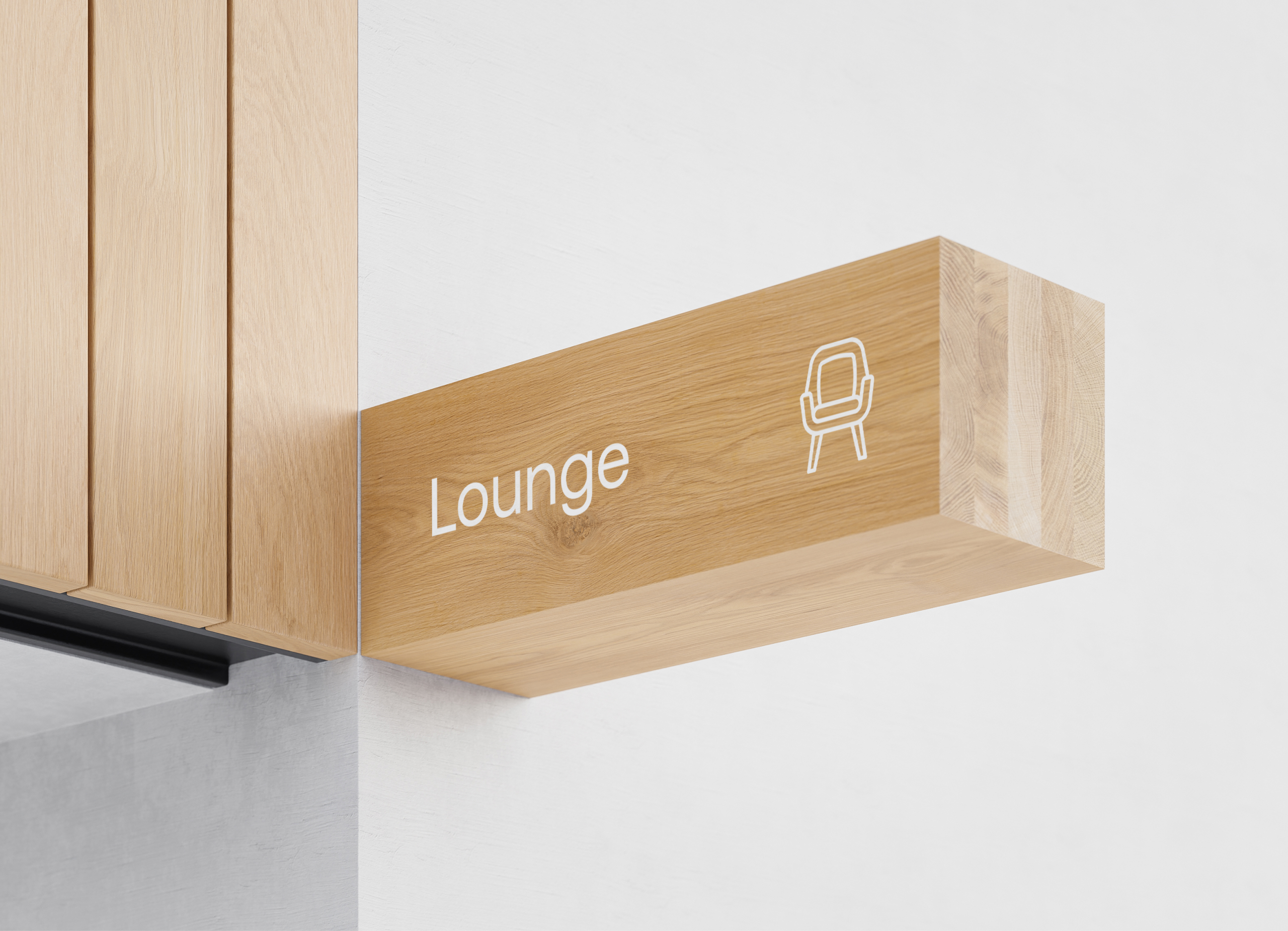
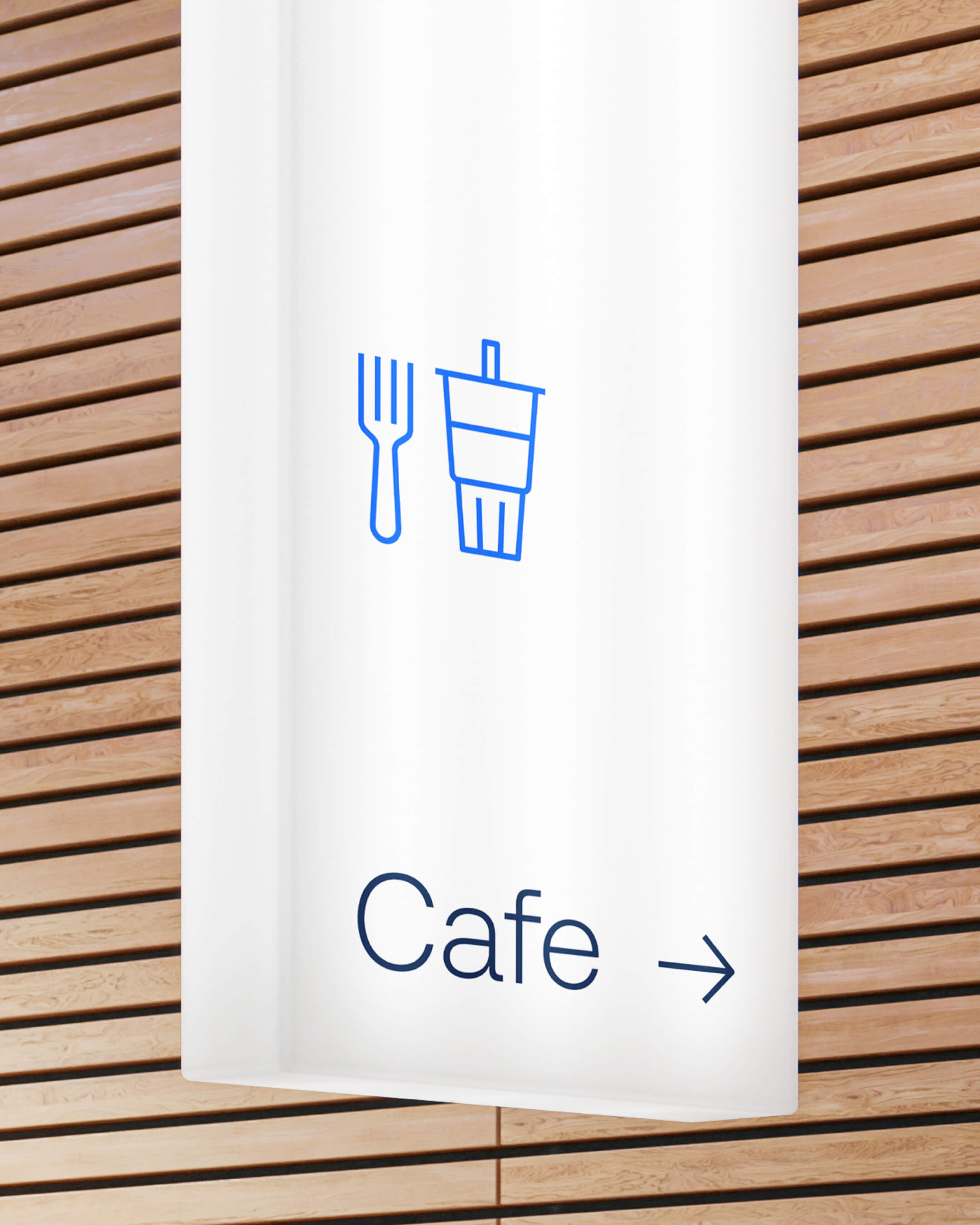
Iconography
Brand Design
As part of the rollout of their redesigned brand system, the team at Burns & McDonnell reached out for a fresh perspective on their iconographic assets library.
Prior to digging into a new icon system, the team had initially reached out for holistic design system thinking and exploration based around their clarified global vision for the rebrand, as well as an approved set of refreshed brand colors and typography.
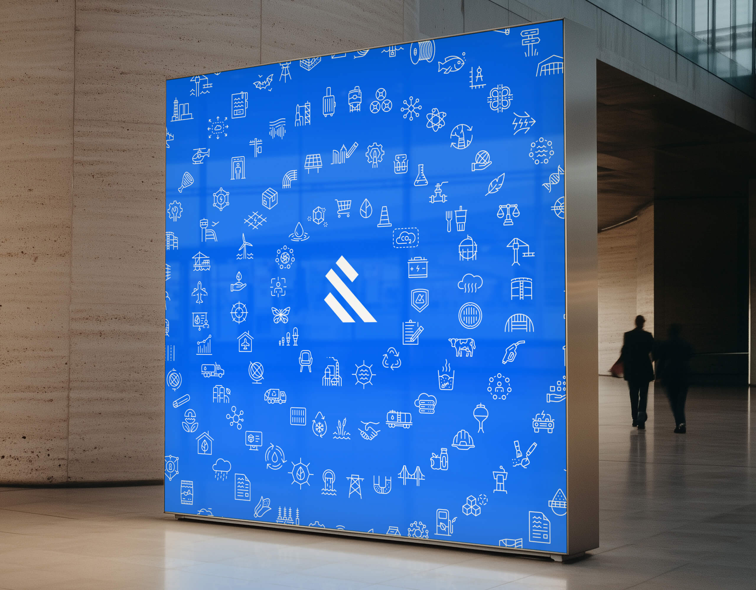
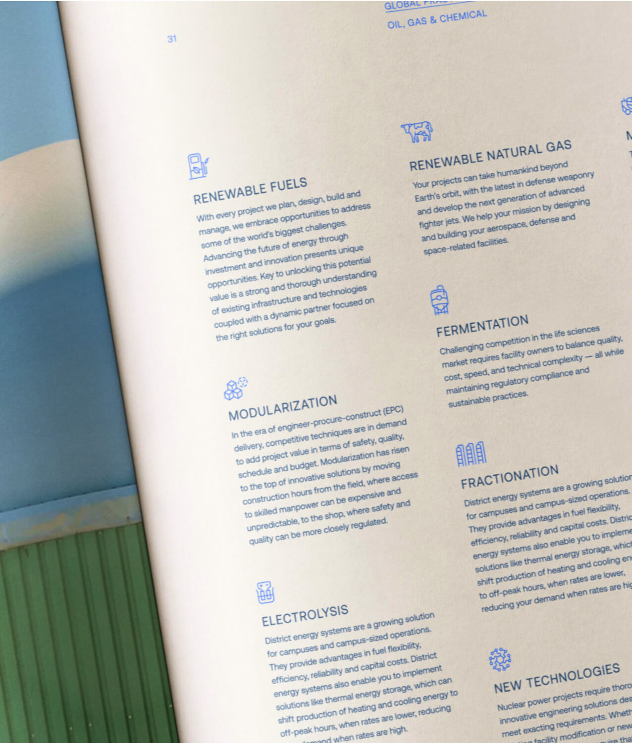
At a strategic level, the iconography needed to function effortlessly at a massive scale, spanning 11 different global divisions of the company (“Global Practices”, as they’re known internally)—these icons would be used in more than 10 countries and across 64 offices in North America.
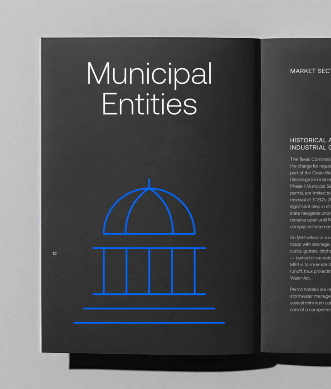
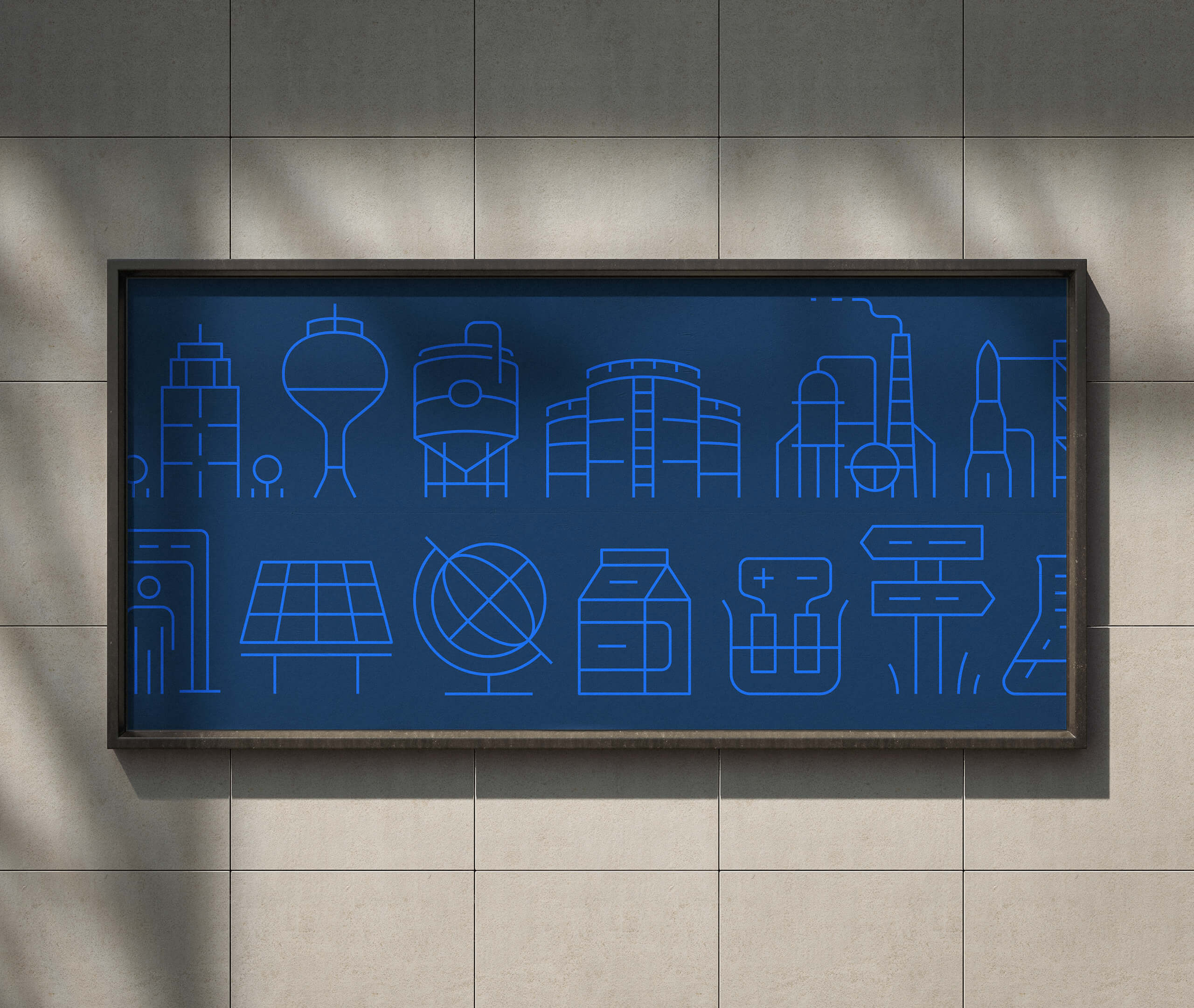
We worked together to build a fully-custom icon library of over 200 icons (and still growing), led by the reduced and impactful sensibilities that the new design system was built on.
One of the main successes of the iconographic system was in its usage of recurring motifs across the library. Building familiarity through the use and reuse of similar symbols and objects across the system became an important factor in our decision-making. There are many symbols or elements that occur in different varieties throughout the library, and intentionally so, as a means of building recognizability and scalability into the system as it continues to grow.
Many thanks to Kael Little and Krista Masilionis for the trust and direction on such a large effort!
Prior to digging into a new icon system, the team had initially reached out for holistic design system thinking and exploration based around their clarified global vision for the rebrand, as well as an approved set of refreshed brand colors and typography.
At a strategic level, the iconography needed to function effortlessly at a massive scale, spanning 11 different global divisions of the company (“Global Practices”, as they’re known internally)—these icons would be used in more than 10 countries and across 64 offices in North America.
We worked together to build a fully-custom icon library of over 200 icons (and still growing), led by the reduced and impactful sensibilities that the new design system was built on.
One of the main successes of the iconographic system was in its usage of recurring motifs across the library. Building familiarity through the use and reuse of similar symbols and objects across the system became an important factor in our decision-making. There are many symbols or elements that occur in different varieties throughout the library, and intentionally so, as a means of building recognizability and scalability into the system as it continues to grow.
Many thanks to Kael Little and Krista Masilionis for the trust and direction on such a large effort!